Anime/ Manga is the first style I leaned to when I first started drawing with 9 years old. The vibrance of colors and movements from anime has always called my attention. I didn’t have access to manga magazines when I was little, so I tried to copy that style of drawing from the shows I was able to watch at that time. My early sketch notebooks are filled with inazuma eleven, megaman x (not the anime, the games, but the style from covers and characters are anime) and sonic x characters (mostly sonic, because I was a huge sonic fan) and other characters as well. Today, after studying art fundamentals and applying it on realism, I am able to draw anime style with the fundamentals in mind, what should be the right way of learning stylized art, since anime is a kind of stylization. Just a reminder, I don’t own the character, this is a fanart, with the goal of studying, showing my skills to others and showing my affection for the character.
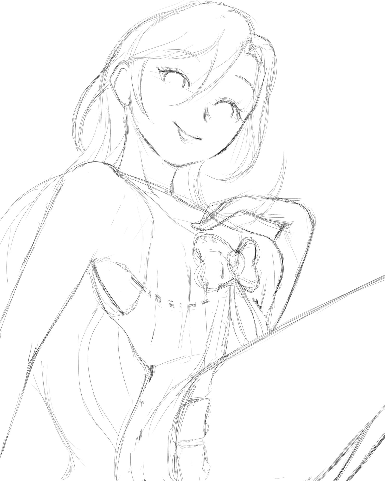
As for all my art, it doesn’t matter the style I go for, I always make sure to do a very clean sketch, so I can have a very good perception of perspective, shapes, forms and much more. On anime style, since my very next step is the lineart and I don’t keep the sketch as a transparent layer, I don’t spend as much time in this stage then different styles, because I can also adjust some proportion mistakes on the lineart stage.
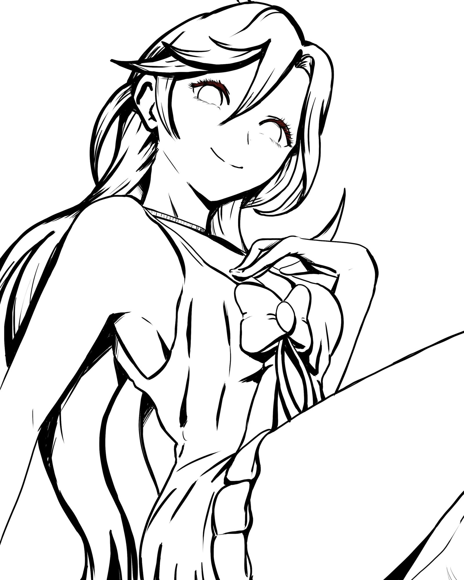
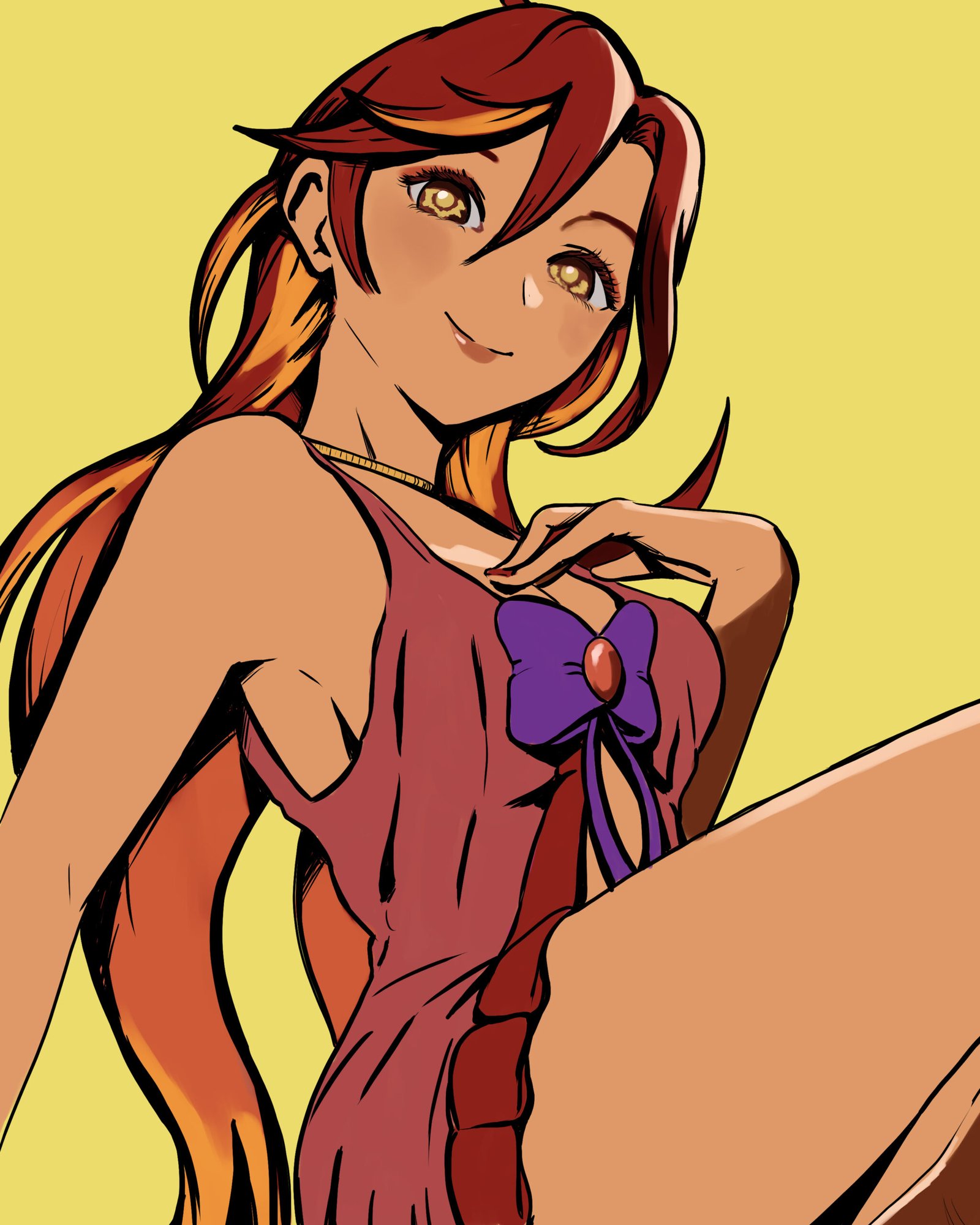
Being guided by my sketch, I finished my lineart. I really like thick lines and larger black shapes to give this impression of contrast and defined shapes. For my lineart, I use a G-sharp brush. Drawing with a sharp brush is fundamental for the lineart to look like this, no smooth brushes in this stage.
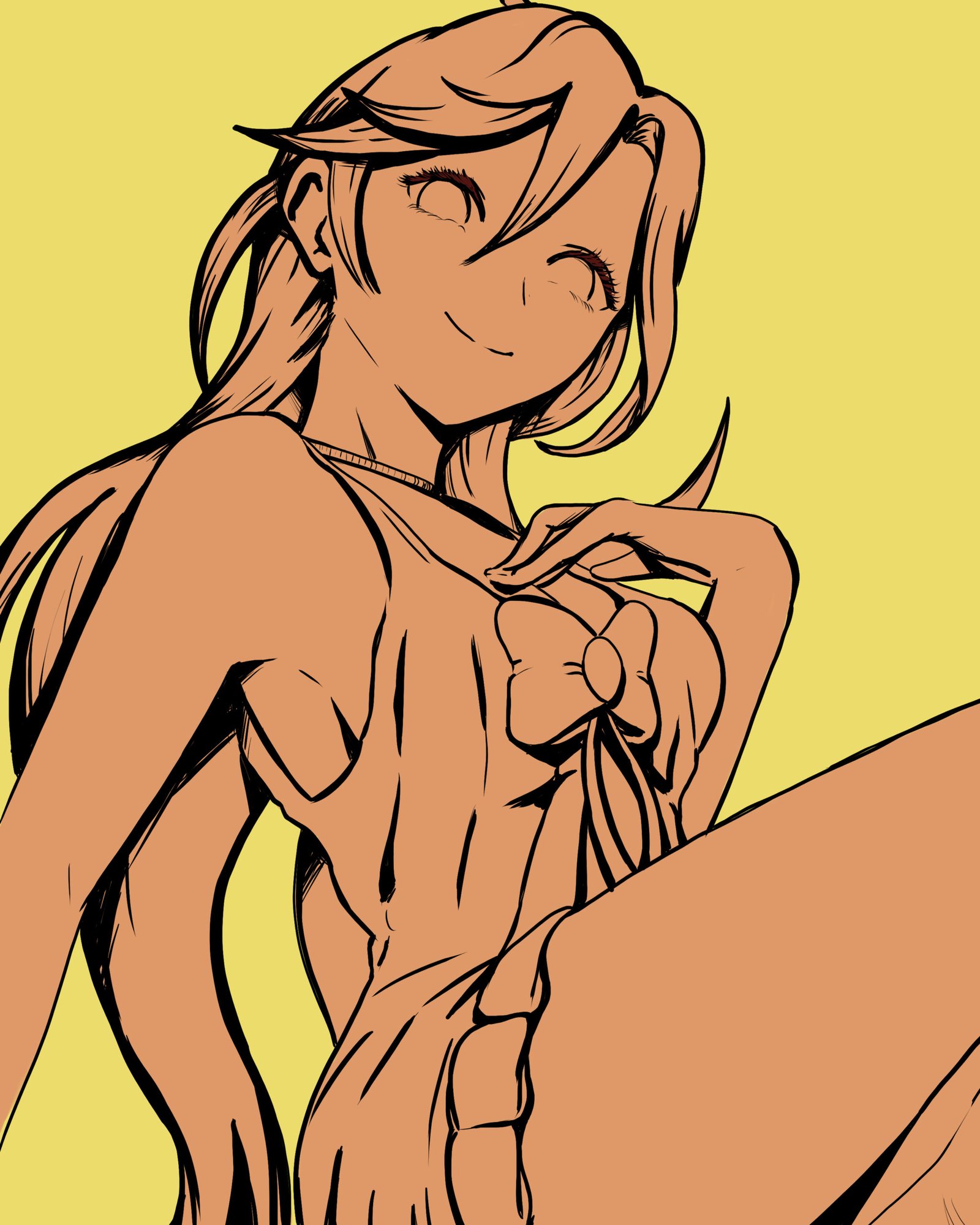
This stage is very simple and very fast. I created a layer and, with the fill tool, I applied the yellowish color for the background. With a magic wand tool, I selected the outside of my lineart and inverted the selected area to make the interior of the lineart selected. I created another layer for the character, and with that, all it’s left was using the fill tool again to apply the orangish color as a basic flat color to be clipped for the above layers. It takes seconds to make it happen. It’s by far, the fastest step of my art process on anime style. Different styles require different strategies to be able to create this flat color on the character shape, but if the style involves lineart, filling it is usually very fast.
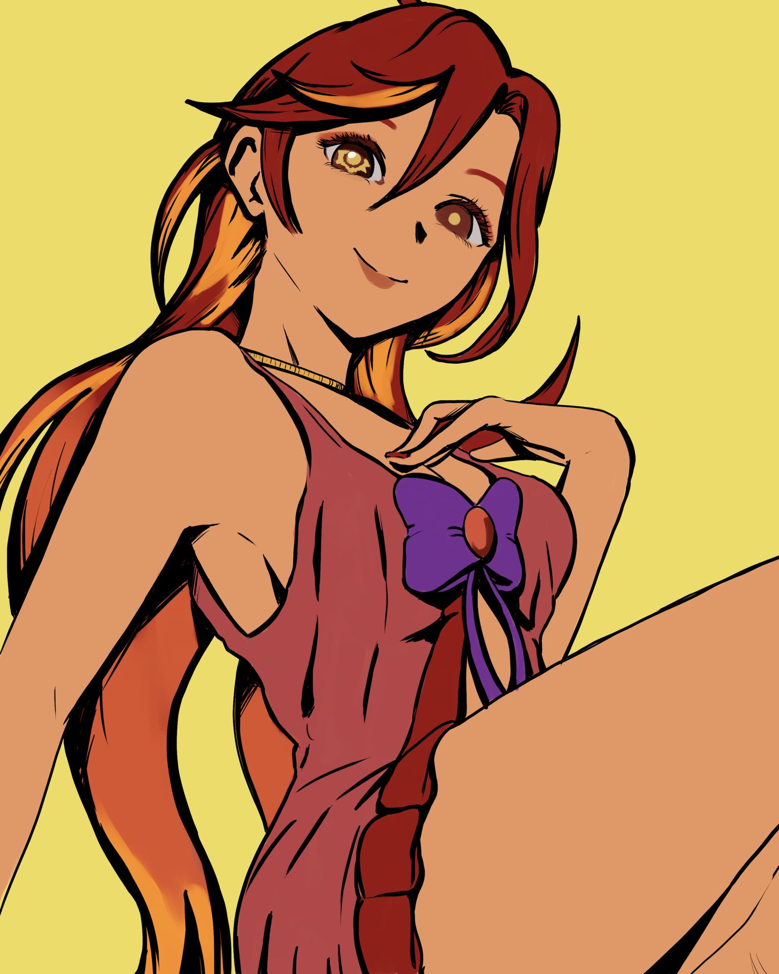
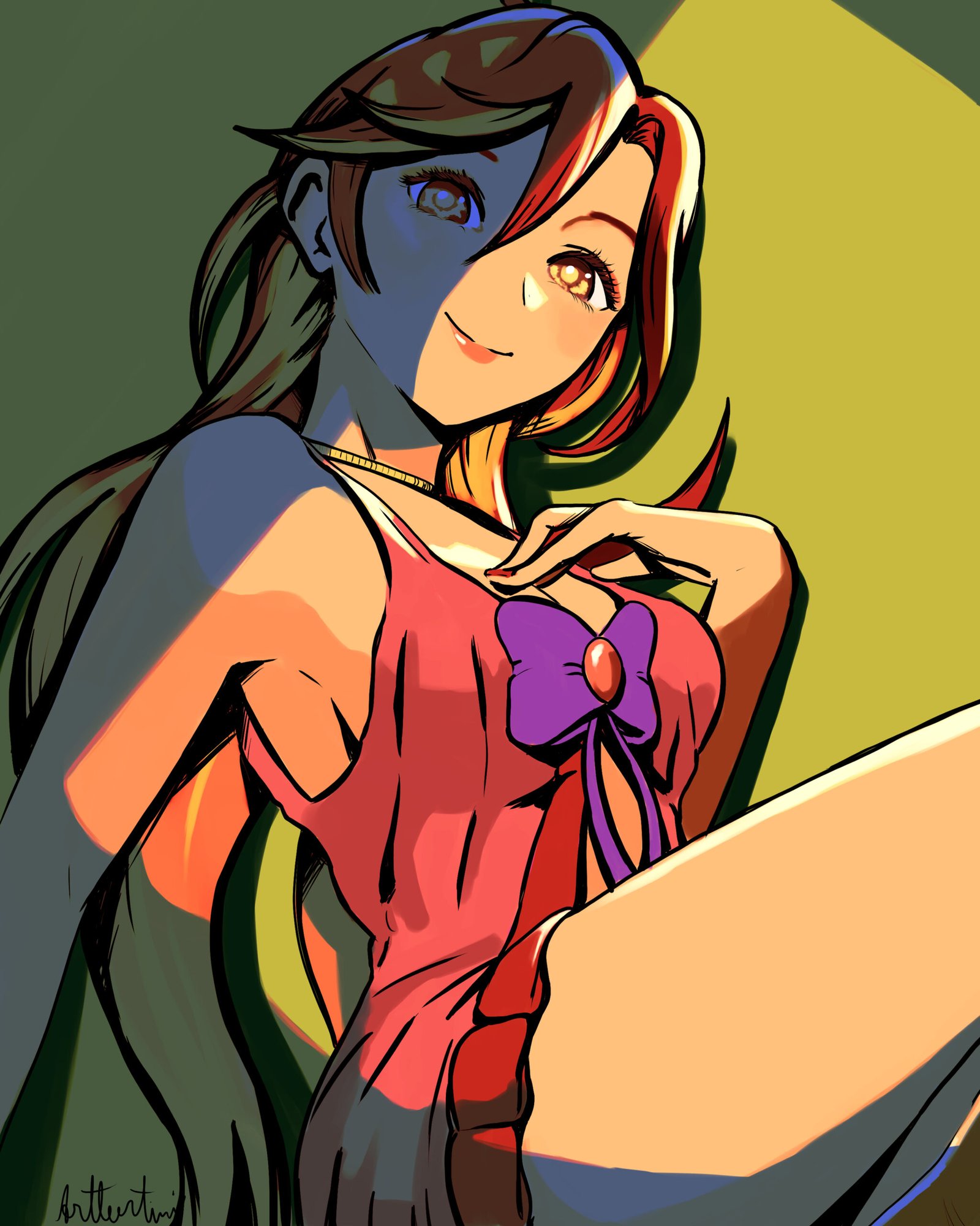
In this phase, I painted basic colors for her features. This stage is very important when you are creating a character, because you can pick the colors you want and try it out to see what looks good and what doesn’t. Since I created this very simple outfit for her, trying out different colors was very fast and easy, but when you have more detailed outfits, different strategies may be more beneficial for less time consuming, like gray scale to color, which is a very useful strategy for concept artists.
Here I painted some highlights and also some shading areas too. Usually I do shades first and then I go for highlights, since it is easy to visualize contrasts painting dark color shapes first and, after that, adding bright dull colors as highlights. For this art piece, I started with highlights first. Why? I actually don’t know. When you are learning art, changing the orders can actually affect the final result of your art piece, but after doing it for quite some time, this doesn’t change the final results anymore. It just feels weird not following the same steps you are used to. Like always adding two spoons of sugar into your coffee and then, one day, you add the two sugar spoons first in your mug and then you pour coffee in the mug. It doesn’t change the final result, but… feels weird.
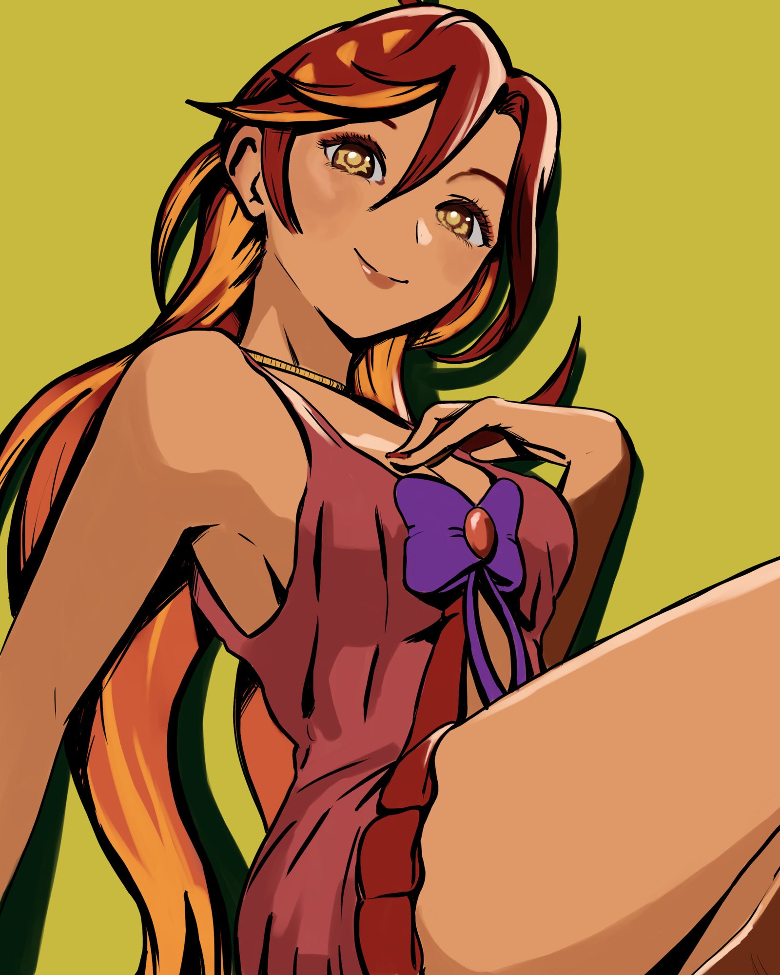
All right, now I painted the shading areas. Nothing crazy and dramatic, I just visualize from where light is hitting my character and the shapes it will create to add darker and more saturated colors in. My aim isn’t for a perfect realistic accurate representation of shades being created by the light source, just a very close representation of it. There are different strategies to paint shading areas, but the one I used here is very straightforward. I just painted with a round mixing brush. You can also create a multiply layer and paint it on top of your basic color layer. You can also mark shapes with a different color G-sharp brush and, after that, use the fill tool to instantly cover that whole shape. This strategy can save some time on the final piece, but it feels very mechanical, and I like the feeling of painting it, so I just did that. You can also do gray scale to colors as I mentioned before. Yhea plenty ways to do it.
Now, for the final step, I added an orangish glow dodge blending layer on top of my normal layers that I was painting to make her look more glowy. I also added another bluish darken blending layer and created this nice cool effect on her just to create this contrast of blue and orange that I visually like. After all these steps and signing my art piece, it was completed.
